PKP Services Inc
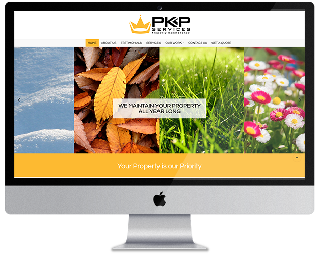
PKP Services is a property maintenance service provider in the Greater Toronto Area. In the last two decades, the company has been offering outstanding property maintenance services across various types of sectors including; residential, commercial, retail, and corporate. SLK IT solutions had a challenge to ensure that the website becomes a genuine spokesperson for the company with an extremely impeccable track record to its name. The simplicity of the home page elements is subtle but difficult to miss. With a revolving banner, we had used a realistic blend of graphics and text.
Visit Website
Web Design & Development
While creating and designing the website, we needed to incorporate various design elements that add to the look and feel of the site. One such tool that we used was the custom slideshow. With a slideshow, we could present the different service points of PKP Services in one single place. The slide show is a good and impressive way of giving a synopsis of what the company does and how well customers rate it on various facets. We have also used images, videos, and other customized graphics to make it look interesting and engaging. Then there is the photo gallery where users and visitors get an upfront view of how the experts carry out their work at PKP Services.
Logo Design
SLK and PKP Services were extreamly satisfied with the outcome of this new logo. The logo incorporated the crown to showcase the high class service that is provided for all cleints. SLK braught together the gold and black colors to make the logo stand out while on all marketing material. Rather it be a shirt, truck or a building PKP Services logo will stand out.

Typography

Color Palette


