Dr. Marta Bejuk
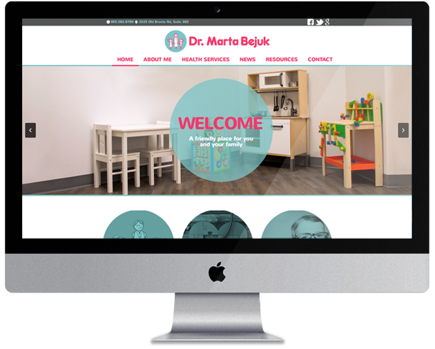
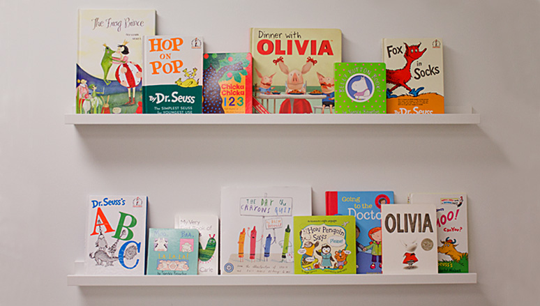
Dr. Marta Bejuk approached us with a goal to develop her brand and website that was as unique, stylish and playful as her practice. Our creative team visited her office and took inspiration from the childrens books on display and the office’s colour palette. We applied the playful and sleek modern sensibilities of her office by designing her a logo and wordmark to have an illustrated feel. Our objective was to ensure that each element of her brand would have the ability to attract both parents and children. To soften her brand’s colour palette for screen applications we introduced a neutral gray that sits nicely between the pink and turquoise.
Branding Process
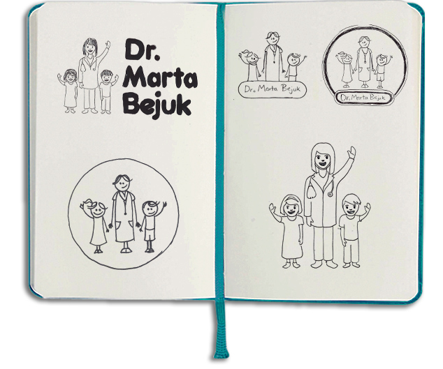
We conducted a thorough research process that included children's media, toys and publications. This was an essential step to help us with creating a playful and youthful brand.


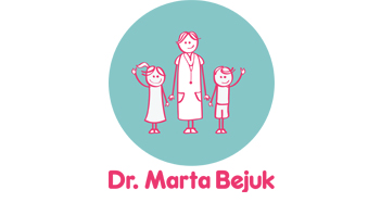
Other Variations

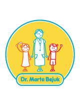

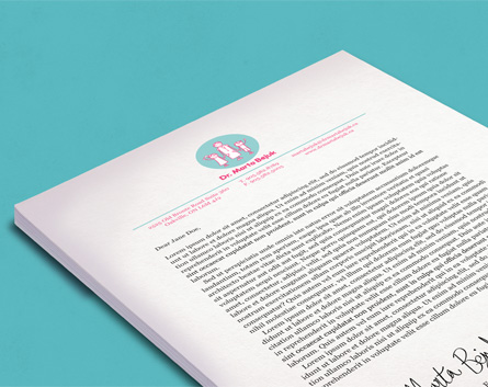
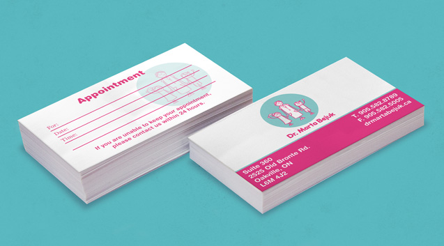
Stationery
Typography

Color Palette

SG Frankfurter SH
We altered the letters we found from the SG Frankfurter typeface to give the logo a more distinctive flavour.
Our creative team visited her office and took inspiration from the childrens books on display and the office’s colour palette.
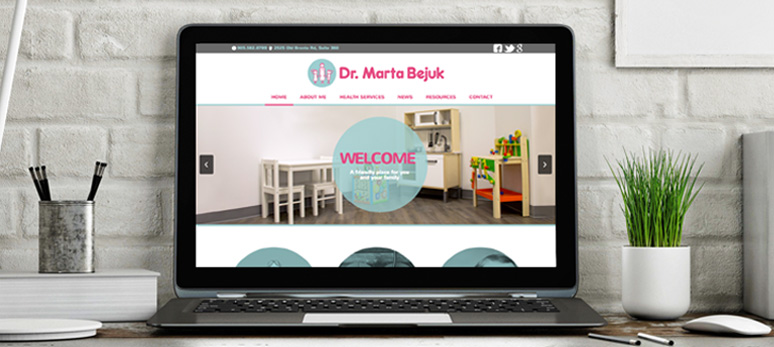
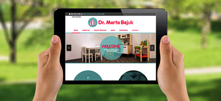
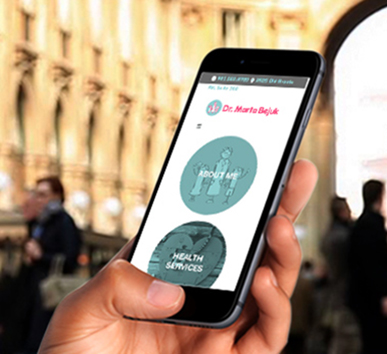
Responsive Design
Our designers and developers made it possible for everyone to be able to connect to Dr. Marta Bejuk. Her webiste and social media has attracted many patients and her new office has quickly built a solid reputation.
Interested In A Health or Lifestyle Website?

