SLK Blog
Typography and your website
Now that we’ve gone over colour, let's look at another seemingly small element that can make a huge difference in the look of your website. And you’re looking at it right now, your website’s typeface and font.
Before we go any further, let’s clear up what we mean by those terms. Contrary to popular belief, font does not refer to the different names of different texts, i.e. Times New Roman, Helvetica, Cambria etc. Those are typefaces. Font refers to the different forms within a typeface, i.e. bold, italics, size of the letters etc.
It’s important to use a typeface to its full potential. A website can be completely transformed just by a simple typeface switch.
Just like colour, you don’t want to overwhelm your reader. Stick to three fonts maximum. One for your headers (e.g. headings, titles, navigation bar, menu etc.) and one for your body text (e.g. articles, content paragraphs etc.) If appropriate, a third font can be used for special headings, your logo, or anything else that you want to be eye catching or different.
So how do you pick the right fonts? Well much like colour, different typefaces convey different messages and moods. The best way to choose is by first acknowledging the type of company you own, or have been tasked to work for. Suppose you were designing a website for a spa, a soccer team and a charitable foundation. In each case, a different typographical treatment would be necessary, as the purpose and sentiment of each design differs.
Think about what you are trying to say, and how you want the viewer to feel when they view your design. Ask yourself, is this clear? Could they read a block of text in this? Does is stand out? Is it inviting? Does this send the right message? Google Fonts has a huge database of free typefaces, and there are many other websites that offer the same.
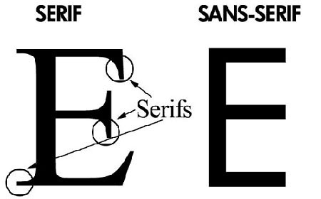
When deciding what fonts to pair together, a general rule of thumb is to pick one sans-serif font and one serif font. The difference between the two can be seen here:
Having these two together can break up the monotony of the text. Different fonts can also help this as well.
If the seemingly endless options of typefaces have you too overwhelmed, don’t be afraid to stick with the classics. Helvetica is one of the world’s most popular typefaces for a reason: it’s simple, easy to read, versatile and recognizable. Pair that with a well-known serif typeface such as ‘Georgia’ and you’re already on your way towards a clean website design.
There’s no one right combination or typeface. Just being aware that they matter is already a step in the right direction. Look out for a list of the best free font sites in our next blog post!